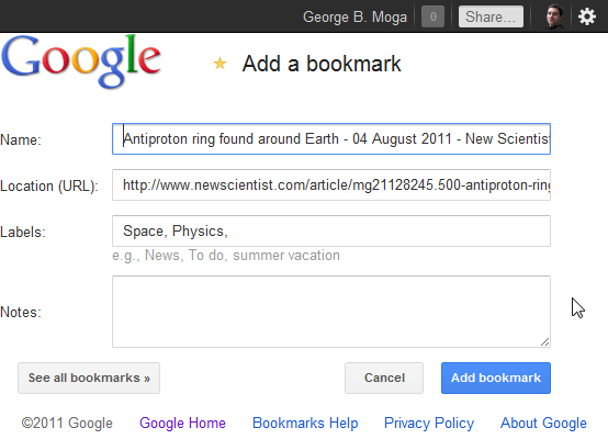
After many popular Google services had their interface updated to be consistent with Google+ – the latest being Google Docs – it’s time for the less popular to slowly join the club: in this case Google Bookmarks. But curiously the main web interface hasn’t been updated, only the pop-up window you see when using the bookmarklet, as I noticed the day before. I have to assume a facelift for the web app is also planned, otherwise the move is a little odd. Or will the bookmarklet be integrated into Google+, enabling users to share any page without the Google bar? That seems rather unlikely… 
Despite it’s potential, Google Bookmarks doesn’t get much attention in Google; the last update was more than a year ago, when lists were introduced. And even though Chrome bookmarks are no longer accessible online through Google Docs, there are no signs they will be added to the only logical service. Still, someone found the time to redo the interface according to the new guidelines… One has to wonder, as many do on Twitter, whether or when will Google Reader receive the new Plus-look? Although personally I hope it never happens, or at least that it’s optional and users can keep the current interface. I admire the goal of making the interface consistent across all web-apps, but sometimes that’s not the best idea. As the feedback for the Gmail theme showed, people don’t like the wasted screen space and low contrast. It works in Calendar because I use it for a couple of minutes a day tops, it’s still bearable; in Gmail I find it annoying to see less messages. The same would surely happen in Google Reader: I value the information I get much more than a fancy interface, especially one that emphasizes the action buttons instead of the content.
Post a Comment